
Are Your Digital Experiences Age-Inclusive?
How Subtle Interface Choices Drive Away Your Highest-Value Users

Welcome to age/proof design, the newsletter for forward-thinking product and design professionals who are reconsidering everything they thought they knew about older users.
In The $22 Trillion Blind Spot, we exposed the three lies keeping you from reaching the longevity economy — that powerhouse user base controlling 83% of household wealth¹.
But awareness is just the beginning.
Now, I want to push you beyond recognition and into action. Because while you’re reading this, your smartest competitor is probably testing interfaces with users over 50.
They’re discovering what I learned the hard way. That respectful design isn’t just good ethics — it’s a devastating competitive strategy.
Most product and design teams don’t wake up thinking, “Let’s create something that excludes people over 50.”
Yet that’s exactly what happens when assumptions go unchallenged. I’ve seen this pattern across my years working in product and UX.
Interfaces get built for idealized users: mobile-native and lightning-fast.
Remember, life stage trumps birth year.
Here’s how to turn that insight into a competitive advantage…
Every Day You Wait, Competitors Get Ahead
When auditing digital experiences, I see the same pattern everywhere. Interfaces that subtly signal “this isn't for you” to users with the highest lifetime value.
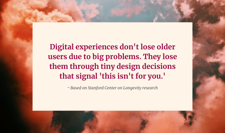
Here’s what concerns me: Research from the Stanford Center on Longevity shows that digital exclusion often stems not from a single barrier, but from a buildup of small usability issues that erode trust and drive disengagement over time².
Companies are hemorrhaging their most valuable customers through a thousand tiny cuts — and don’t even realize it's happening.
Meanwhile, the companies getting this right discovered something counterintuitive. When they design for those over age 50, their younger users start engaging more too.
It’s the digital version of the curb-cut effect.
Just like sidewalk ramps designed for wheelchairs ended up helping parents with strollers, delivery workers, and travelers with luggage — inclusive digital design helps everyone. Not just marginalized groups.
Turns out, respectful design isn't a compromise. It’s an upgrade.
Here’s the insight most teams miss: exclusion and friction often look the same.
What we think is a minor UX decision is actually a revenue decision.
Patterns Silently Destroying Older User Trust
I recently learned about a user testing session with a 62-year-old VP of Marketing using an investment app. She navigated perfectly until hitting one specific feature — then abandoned completely.
The culprit?
Language that said “Don't worry. We'll guide you through this step-by-step!” for a complex feature enrollment.
Her feedback caught everyone off guard.
“This talks to me like I’m confused. I manage a $13 million advertising budget. I can assure you I’m not confused.”
That’s not an edge case. That’s one of your highest-value users telling you exactly why they’re leaving.
The Photo Viewing Problem
Consider how many apps require pinch-to-zoom to view images clearly. Seems reasonable until you realize users aren’t zooming to see more detail — they’re struggling to read basic information.
The interaction adds complexity without adding value.
The insight?
Users aren’t failing because they can’t perform gestures. They’re abandoning because simple tasks feel unnecessarily complex.
The Readability Challenge
Many modern apps use light gray text on white backgrounds for aesthetic reasons. But when tested in real-world conditions — phones in bright conference rooms, laptops in coffee shops — readability suffers significantly across all ages².
The users most likely to abandon apps with poor readability often have the highest engagement potential.
Hint: it’s the age 50+ user.
The Interface Complexity Paradox
E-commerce platforms often add swipe actions, quick-buy gestures, and complex filtering interfaces, thinking power shoppers want advanced features.
Yet Baymard Institute’s research on checkout optimization reveals that 18% of users abandon purchases due to interface complexity — and their studies show that simplifying interactions can improve conversion rates by up to 35%.
Jakob Nielsen’s foundational usability research confirms this pattern. Simpler interactions consistently reduce errors and increase task completion across all user segments, regardless of technical proficiency.
The Respectful Design Framework
Here are four specific ways to audit your experiences based on everything we’ve covered so far:
1. Language Test
What I look for: Copy that assumes confusion instead of acknowledging competence.
Real example: Nielsen Norman Group’s research on usability heuristics emphasizes that interface language should “speak the users’ language” using “words, phrases, and concepts familiar to the user, rather than internal jargon”³.
Studies consistently show that respectful, direct language improves user engagement more than patronizing phrases that assume confusion.
The quick check: Read your interface copy out loud as if you’re addressing someone older that you personally respect and admire. Does it sound condescending?
Tip: It’s even better if you actually have someone over 50 read it and give you feedback.
2. Gesture Reality Check
What I look for: Interactions that require hidden knowledge or advanced dexterity without providing alternatives.
Real example: Music streaming apps that work well across age groups typically feature large, clear control buttons (minimum 44px touch targets) and simple navigation patterns that don't require users to master complex gestures.
High contrast elements and clear visual hierarchy reduce cognitive load for everyone.
The quick check: Can your core features be accessed without double-taps, long-presses, or multi-finger gestures? If not, your highest value users might be struggling silently.
3. Context Audit
What I look for: Designs that only work in perfect conditions — ideal lighting, full attention, latest devices.
Real example: Nielsen Norman Group’s long-term research on older adults found that “interface text on mobile apps was often too small and lightly colored for older adults to read comfortably”⁴.
Research confirms that text scaling and high contrast improve engagement across all age groups, with the greatest benefits for users over 65.
The quick check: Test your interface on an actual phone in bright sunlight. Can you read text comfortably? Are touch targets at least 44px? Do hover states work on touch devices, or do they create dead-end interactions?
4. Assumption Challenge
What I look for: Default settings and flows that assume high digital fluency.
Real example: E-commerce platforms that streamline checkout processes — reducing steps and simplifying decisions — tend to see improved conversion rates across all user segments.
This is the curb-cut effect in action. Simpler flows serve both efficiency and accessibility.
The quick check: Are your defaults optimized for your most tech-savvy team member or your actual user base?
What Success Actually Looks Like (And Why It Surprises Everyone)
Studies on mobile app user-friendliness for older adults show when financial services and other apps implement age-inclusive design principles — such as respectful language, readable text, and simplified interactions — user satisfaction increases significantly⁵.
Research demonstrates that design changes benefiting older users simultaneously improve experiences for younger ones too.
What looks like “designing for older users” is actually just designing better.
Clearer language reduces support calls across all segments. Simpler interactions decrease abandonment rates universally. Better contrast improves task completion for everyone.
This breaks a fundamental assumption most teams hold. That inclusive design requires compromise.
It doesn’t. It requires thinking.
The Real Competitive Insight
Here’s what I know from watching this transformation unfold: Companies moving on this are capturing greater market share while others debate whether it matters.
Look no further than Caddis — an eyewear company that intentionally serves “older customers”.
Other sectors are taking note…
Travel platforms are discovering that respectful design drives higher conversion rates across all user segments.
Healthcare apps are finding that accessibility-first approaches reduce support costs while increasing user satisfaction.
E-commerce sites are seeing that clearer interfaces boost revenue per user.
But here’s the thing about competitive advantages: they disappear when everyone figures them out!
What Happens Next Can Change Our Deep-Seated Assumptions About Age
Most exclusionary design decisions don’t happen intentionally.
In Part 3, Understanding Users Beyond Stereotypes, I’ll expose the specific assumptions costing you your most valuable users and show you how to rebuild your research around what actually predicts user success.
You’ll discover:
Why your 62-year-old user might be an angel investor toggling between three fintech apps while your 35-year-old user Googles “how to share a PDF”
The brutal truth from MIT AgeLab research: most digital products fail with older users not because of usability barriers, but because persona assumptions are fundamentally wrong
How Stanford Center on Longevity research proves digital behavior correlates with current life activities, not birth dates — and what this means for your user research
The Behavior-First Persona Framework that gets C-suite buy-in by connecting user research directly to revenue
Because the real competitive advantage isn't just inclusive design. It’s an accurate understanding of users in an economy that's significantly transforming.
Until next time,
References
¹ Joseph F. Coughlin, The Longevity Economy: Unlocking the World’s Fastest-Growing, Most Misunderstood Market (PublicAffairs, 2017).
² Stanford Center on Longevity, Sightlines Project: Usability and Aging in Digital Interfaces (Stanford University, 2020).
³ Jakob Nielsen and Rolf Molich, Heuristic Evaluation of User Interfaces (Nielsen Norman Group, 1990).
⁴ Nielsen Norman Group, Designing for Older Adults: 23 Years of Research (NN/g Longitudinal Usability Report, 2024).
⁵ Yuanyuan Zhao et al., Mobile App Usability for Older Adults: A Systematic Review (Journal of Medical Internet Research, 2021).
Join the Movement
The longevity economy isn’t coming — it’s here.
And the window for first-mover advantage is closing.
The question is whether you'll lead this transformation — or watch competitors capture the opportunity while you catch up.
Join other product and design professionals who are already rethinking their approach. Subscribe to get each part of this essential series delivered directly to your inbox.
This isn’t about designing for “older users.”
It’s about designing smarter, for everyone.
Because the future belongs to companies that understand this simple truth:
When you design for longevity, everyone wins.
Share age/proof design
Enjoyed this issue? Please forward this to friends or share by clicking below: